It always interests us when taking on design work to look into the meaning of colours and how they would reflect in our work. We found this chart of the Psychology of Color via pinterest and had to share its a great summary of how to select colours for your home or work.

Showing posts with label colours. Show all posts
Showing posts with label colours. Show all posts
Friday, February 24, 2012


Tuesday, January 17, 2012
We're Loving Pink
For our first inspiration boards of the year we couldn't go past pink, though we are not typically 'pink girls' we loved how elegant pastel pink can look when done right.
For weddings a soft pretty pastel pink with accents of gold really is a beautiful combination. The gold cutlery is an elegant addition to the table settings as is the gold trim around the wedding cake. The vintage suitcase is a great idea for collecting your wedding cards or wishing well donations on the day, you can even use the suitcase as a keepsake box for the cards and mementos of your special day.
 |
|
6.
Martha Stewart, 7. Martha Stewart
|
Grey is one of our favourite colours to add an accent colour to (those who have followed our blog for a while will know we love grey & yellow!). Pastel pink is no exception, here are a few interior spaces using pastel pink that we loved. Mia needs the pink children's chair for her room, I wish Target US shipped to Australia! (Update, the chair is now out of stock online)
 |
|
6. Pinterest
|
Friday, January 13, 2012
2012 Pantone Colour of the Year
Pantone have selected their new colour of the year for 2012...Tangerine Tango.
 |
| Pantone |
“Sophisticated but at the same time dramatic and seductive, Tangerine Tango is an orange with a lot of depth to it,” said Leatrice Eiseman, executive director of the Pantone Color Institute®. “Reminiscent of the radiant shadings of a sunset, Tangerine Tango marries the vivaciousness and adrenaline rush of red with the friendliness and warmth of yellow, to form a high-visibility, magnetic hue that emanates heat and energy.” Pantone.com
Tuesday, December 6, 2011
A Wedding in Tuscany
It seems such a while ago since we have had the time to sit down and go through our favourite wedding websites and look for inspiration for new designs during this busy Christmas time. So when I came across this wedding I had flagged to come back to for the beautiful colour theme I had to share this whimsical and fun filled wedding.
 |
| Style Me Pretty |
 |
| Style Me Pretty |
 |
| Style Me Pretty |
 |
| Style Me Pretty |
 |
| Style Me Pretty |
 |
| Style Me Pretty |
We love the design asthetic of birdcages (see our Lovebirds Wedding Invitation here) and absolutely love them filled with flowers for the table settings...
 |
| Style Me Pretty |
This pinwheel idea for the tables is a great to keep the kids entertained too!
 |
| Style Me Pretty |
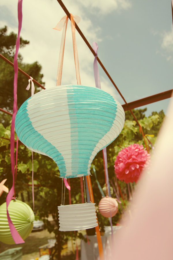
I'd love to know where to get these hot air ballon laterns! They would be great for a kids birthday party.
 |
| Style Me Pretty |
Just look at this stunning location...
 |
| Style Me Pretty |
 |
| Style Me Pretty |
* Photography by Aubrey Joy Photography
Friday, October 21, 2011
We're Loving Navy
Navy is becoming one of our new favourite colours. Our addiction to Pinterest lead us to find these great inspiration photos for navy colour themed weddings and interior decorating.
The combination of navy & white is a fresh contrast with pops of colour in the flowers and table settings just seem to work really well. Navy lends itself to all seasons, the photos below remind us of spring but you could easily use navy in a winter theme wedding with ivory flowers and snowflake motifs.
 |
| 1,2,4,5,6,7 Style Me Pretty, 3 & 8 Wahoo Weddings |
We love this Madeline chair (pic 1) from Urban Outfitters it would be perfect for a small reading nook. I would never have thought of navy in a nursery (pic 5) but it works really well with the contrast mint shelves and artwork to break up the dark wall. Picture 6 reminds me of the buffet cabinet and blue feature wall I have in my lounge room, though not as neatly organised!
 |

What do you think of navy used in weddings and interiors, too dark? Or with the right lighting and contrasting accents you could pull it off?
Monday, October 17, 2011
An Indian Wedding
This wedding is so colourful and fun we had to share. The theme is traditional Indian mixed with funky trendy aspects and the couple's love of animals had to feature as an accent throughout the wedding in the table settings and artwork throughout the reception.
The couple Nisha and Sam, hired Amorology to plan their big day and they did a fantastic job. I think we will be adding them to our blog love list for sure!
The couple Nisha and Sam, hired Amorology to plan their big day and they did a fantastic job. I think we will be adding them to our blog love list for sure!
For more details about this special wedding, visit Style Me Pretty here
 |
| Style Me Pretty |
 |
| Style Me Pretty |
 |
| Style Me Pretty |
 |
| Style Me Pretty |
 |
| Style Me Pretty |
 |
| Style Me Pretty |
 |
| Style Me Pretty |
 |
| Style Me Pretty |
 |
| Style Me Pretty |
 |
| Style Me Pretty |
 |
| Style Me Pretty |
 |
| Style Me Pretty |
|
| Style Me Pretty |
 |
| Style Me Pretty |
 |
| Style Me Pretty |
 |
| Style Me Pretty |
 |
| Style Me Pretty |
Tuesday, July 5, 2011
We're Loving Aqua
This bluey/green shade of aqua is my favourite colour. So it was the obvious choice for my bridesmaid's dresses 3 years ago (last week!). I'm happy to see it is still a popular choice for brides today.
 |
| 1. Wedding Chicks, 2. The Perfect Pallete Blog, 3. Wedding Chicks, 4. Wedding Chicks, 5.Wedding Cheesecake via Pinterest, 6. Style Me Pretty via Pinterest, 7. BHLDN, 8. Wedding Chicks, 9. Pinterest, 10. Jamie Hammond Photography, 11. Jamie Hammond Photography |
Shades of aqua are calming and soothing in interiors, it almost makes you feel relaxed just looking at these spaces. This colour lends itself to femine touches while not alienating the man of the house. We love the chalkboard in the kitchen, we keep talking about making one for each of our kitchens, we will keep you posted when we do.
 |
| 1. Pink Wallpaper, 2. Herman Miller, 3. Anthropologie, 4. Sarah Richardson Design 5. House of Turquoise, 6. Project Nursery, 7. Sarah Richardson Design, 8. New House of Art |
Saturday, June 25, 2011
Before & After - Yellow Chairs
Here is a quick before & after. We love how a quick sand & spray paint can transform otherwise boring chairs into statement pieces. Click on the source beneath the photos to find the instructions.
 |
| Design*Sponge |
 |
| Design*Sponge |
Tuesday, April 12, 2011
Really Cool, Real Wedding!
How cool is this wedding? We love how couple Rebecca & Derek were creative & confident enough to pull this off! Find more details here.
We are loving the colour scheme too, hands up who loves yellow & grey! How cute is this vintage 1950's gown?
 |
| Source: Martha Stewart Weddings |
In line with their books and bikes theme, this library card holder holds their engagement photo but what a great idea for holding extra invitation details such as location maps & RSVP cards.
 |
| Source: Martha Stewart Weddings |
Why spend money on flowers if you already own a cute bunch of brooches like this?
 |
| Source: Martha Stewart Weddings |
We have heard of DIY decorations for your wedding, but usually done beforehand and not by your guests and at the wedding!
 |
| Source: Martha Stewart Weddings |
Rebecca and Derek hired cruiser bikes & helmets for guests to be 'transported' from location to location throughout the day.
 |
| Source: Martha Stewart Weddings |
We love this shot, looks like a styled shoot from a magazine...not an actual wedding shot!
 |
| Source: Martha Stewart Weddings |
What attention to detail, we love anything personalised. Instead of a dance floor Rebecca and Derek set up a mini-golf course for guests to be entertained.
 |
| Source: Martha Stewart Weddings |
This unconventional wedding really shows that with a bit of creativity you can stamp your own personality into your special day.
How creative were you with your wedding plans? Have you ever been to a wedding as unconventional as this one?
Thursday, March 31, 2011
Easter Sneak Peek...
Soon to be released is our Easter 'On The Hunt' Package and Invitation.
When designing this package for Easter (with our fav colour theme in mind this week)... we were curious do different colours have a special meaning for Easter? What we found is... Yes colour does have significance at Easter.
When designing this package for Easter (with our fav colour theme in mind this week)... we were curious do different colours have a special meaning for Easter? What we found is... Yes colour does have significance at Easter.
- Pink: Easter colour pink indicates fresh beginning.
- Yellow: It is the color that is related to the brightness of sun. It’s a color that brings joy and happiness.
- Purple: Easter color purple is indicative of royalty. It is said that the color purple brings wealth.
- Green: The color green brings ray of hope. Green is the color of grass.
- Orange: It is the color that represents hope. It is associated with the dawn of day.
- White: This Easter color signifies purity and grace.
Here is a sneak peak of our interpretation of the Easter colours together in an Easter Egg Hunt Invite Package. More designs are coming soon, we will keep you posted with some other ideas to make your Easter Egg Hunt memorable.


Subscribe to:
Posts (Atom)